
In June 2015, the City of Chicago released data to Kaggle and asked competitors to predict which areas of the city would be more prone to West Nile Virus outbreaks.
West Nile Virus (WNV) was first discovered in Uganda in 1937 and persists through the present day in many disparate parts of the world, spreading primarily through female mosquitoes and affecting several types of bird species, as well as other mammals like horses and humans. Infected victims can either be asymptomatic (75% of cases) or display symptoms like fever, rash, vomiting (20% of cases), encephalitis/meningitis (1% of cases), and in rare instances death (1 out of 1500).1 While the first case of WNV in the US was reported in Queens, NYC in 1999, Chicago has been particularly plagued by the disease since it was first reported in the Windy City in 2001. As of 2017, Chicago has reported 90 cases of WNV, eight of which resulted in death.2
Since 2004, Chicago has had set up a surveillance system of mosquito traps designed to monitor which areas of the city were positive for WNV which remains in effect today. Every week from late spring through the fall, mosquitos in traps across the city are tested for the virus. The results of these tests influence when and where the city will spray airborne pesticides to control adult mosquito populations.
In June 2015, the City of Chicago released their data to Kaggle in the form of a competition, asking competitors to analyze their datasets and predict which areas of the city would be more prone to WNV outbreaks, thereby allowing the City and Chicago Department of Public Health (CPHD) to allocate resources more efficiently. The prize, $40,000.
While I was a little late to the competition, this dataset remains one of the more popular sets to analyze, given its depth, complexity, and uniquely inherent challenges. Below, I identify the challenges that came up for me when analyzing this dataset as well as the techniques I used to resolve them.
Going in for a check-up
As with many projects, the raw data was split across a several different dataframes, including a train.csv, a test.csv, a weather.csv, and a spray.csv. The spray.csv was a collection of locations and timestamps where pesticides were sprayed - I initially set this aside given that it was not immediately obvious to me how I could incorporate it into my model.
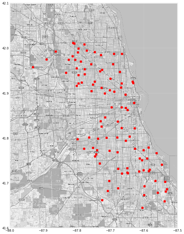
There was also a file filled with location points that represented the city of Chicago. I used this file to identify the traps where WNV was present. These traps are represented by red ‘x’ marks in the map below.
For the weather.csv, I decided to drop the ‘Water1’, ‘Depart’, and ‘Depth’ columns given that volume of values that were missing. I also decided to drop the CodeSum category. There were also some columns with strange values like ‘ T’ which I decided to replace with 0 instead. Finally, I noticed that weather data was collected by two weather stations and seemed largely duplicative. I decided to slice on station1.
Initially, my train (and test) sets had 10 columns and 10506 rows. While there were no null values in the train set, there were values labeled ‘M’ which effectively were nulls. I decided to fill the ‘M’ values with NaNs that I could drop later. I then grouped my train dataframe on ‘Species’, ‘Date’, and ‘Trap’ by the mean to mirror how the test set was organized. I then dropped the ‘Block’, ‘Latitude’,’Longitude’, and ‘AddressAccuracy’ features because I later engineered columns that I thought would be more helpful (and predictive) of WNV.
We’re going to have to operate
I decided to engineer a column called ‘LatLong’ which was a tuple of the ‘Latitude’ and ‘Longitude’ columns zipped together. I did this because I wanted to calculate the distance of any given point in my train data from ‘hot spots’ I identified through aggregating my WNV column. The package I used to calculate distances was vincenty from geopy.distance and takes two args, both of which need to be tuples.
For my first arg in the vincenty function, I created two ‘hot spot’ locations of coordinates by identifying which coordinates had the highest mean value of WNV. I did this by grouping the tupled coordinates in the ‘LatLong’ column, slicing on the ‘WNVPresent’ column and sorting the ‘WNVPresent’ values in descending order. I named the two variables for the top two locations where WNV was present centroid1 (41.974689, -87.890615) and centroid2 (41.673408, -87.599862).
With my centroids identified, I was able to write a for-loop that calculated the distances in miles for each of the tupled location points from the two centroids and saved the result in a list. I applied these list to my dataframe in new features called ‘Distances1’ and ‘Distances2’. I also created another column called ‘Close_to_Centroid2’ which was a lambda function of my ‘Distances2’ feature that binarized whether a point was within five miles of the centroid or not.
Given that the ‘Species’ and ‘Trap’ features were categorical data, I label encoded them into numerical values for modeling purposes. I also applied the datetime function within two lambda functions that I mapped to the ‘Date’ feature. This transformed the one ‘Date’ one column into two - the first date column represented the day of the year (out of 365), and the second column represented the year. This way, these date features could be fed into the model as numerical values instead of objects.
Finally, I merged the weather set onto my train set in preparation of modeling.
We’re going to need to run some tests
One of the most difficult aspects of this project was the fact that the baseline accuracy for the dataset was 95% accuracy. This meant that if you were to guess that WNV was not present, you would be correct 95 out of 100 times. While this may not seem like a big deal, it is very costly to the City to A. spray expensive pesticides where WNV is not present and run the risk of unnecessarily exposing residents to the toxins (a false negative) and B. not spray pesticides where WNV is present and run the risk of residents becoming ill with the virus and potentially being sued for negligence (a false positive).
Keeping this in mind, I installed the imblearn package which contains a class balancer, SMOTEENN. Imblearn’s SMOTEENN is a slight variation of SMOTE (Synthetic Minority Oversampling TEchnique which randomly selects data points in the minority class and creates copies of them that mimic the characteristics of the minority class based on a k nearest neighbors distance calculation. SMOTEENN differs slightly from SMOTE by additionally using Edited Nearest Neighbors (ENN), which in essence “cleans” the data set of points that are not strong representatives of their class. This allows the model to learn more deeply about what characteristics are inherent to the target class.
After balancing the classes, I ran three models: a Random Forest Classifier, XGBoost, and a Balanced Bagging Classifier. I chose these models based on their powerful algorithms to extract information from features and, in the case of XGBoost, learn from mistakes made in the Decision Tree learning process and incorporate that information gain back into training process.
What’s the prognosis?
ROC-AUC is short for Receiver Operating Characteristic - Area Under the Curve. It is a metric created by plotting the true positive rate against the false positive rate.
The true positive rate is also known as recall, where true positives are divided by the sum of true positives and false negatives. The true positive rate is a metric that evaluates the proportion of positive data points that were correctly predicted as positive. A higher true positive rate means better accuracy with respect to positive data points.3
The false positive rate is called the fall-out and is calculated by the number of false positives divided by the sum of false positives and true negatives. This can be interpreted as the proportion of negative data points that were incorrectly predicted as positive. A higher false positive rate means more negative data points are classified incorrectly as positive.4
I plotted the ROC-AUC curves of my three models below.
| Random Forest | XGBoost | Balanced Bagging Classifier |
|---|---|---|
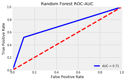 | 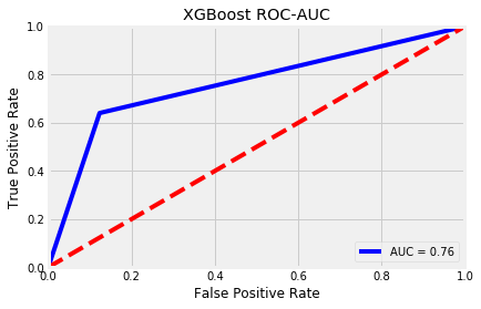 | 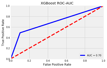 |
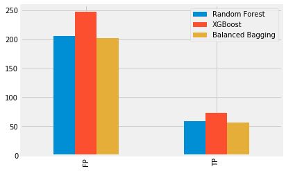
Because the baseline accuracy score was so high already, I wanted to take a closer look at how many positive data points I correctly (and incorrectly) predicted, so I ran a confusion matrix on all three models. I was mostly concerned with reducing the amount of false positives as much as I could while increasing the true positives. For example, while the XGBoost model produced 73 true positives, it also predicted 247 false positives. In comparison, the Balanced Bagging Classifier model only predicted 56 positives correctly, however, it also only incorrectly predicted 202 positives. The decision of which model’s trade-off to choose depends on the goals of the project. On the one hand, it might be better to spray pesticides on more areas that were correctly predicted to have WNV. On the other hand, it also might be more expensive to the City. For illustrative purposes, I plotted the true positives and false positives of all three models below.
Having tuned my models, I submitted my predictions to Kaggle. While my best score was only a 0.61 (score on ROC-AUC), this project was well worth my time. Not only did it allow me to continue learning more about tuning my models and scoring on different metrics, but it also was my first introduction to imbalanced classes. In the real world, (and especially the industries I’m interested in working in, like financial crime) many datasets are severely imbalanced because there just are not many instances of the minority class because it is a rare event. However, in order to create a model that can more accurately predict the minority class, it is up to the data scientist to make the model more sensitive to the signals sent out by the minority class. Knowing how to balance the majority and minority classes allows for better models.
If you’re interested in seeing the code associated with this project, head on over to the related GitHub repo.